Mobile Usability: Introducing New Ranking Signals
-

Aaron Gray
-

 April 27 , 2023
 -
 4 min read
Google shifted its focus on mobile search in 2015 when it rolled out an algorithm update that introduced a new ranking signal. The search engine announced that they would be boosting the visibility of mobile-friendly sites and app content in the SERPs to cater to the evolving preferences of users.
What’s It For
Users have always wanted to get relevant information on their queries instantaneously, and the advent of smartphones paved the way for search to become more accessible. In February 2015, Google announced that they would be rolling out an algorithm update to adapt to users’ browsing behaviors.
The update entailed two significant ranking signals introduced to the search engine:
-
Mobile-Friendliness On April 21, 2015, Google boosted its use of mobile-friendliness as a factor that affects a website’s rank. The change will have an impact on searches done through smartphones or tablets, in any language. This improvement should return high-quality and relevant sites optimized for smaller screens.
Google has provided webmasters with a tool that enables you to test the mobile-friendliness of your pages or domain. You just have to paste in your URL, and the program will analyze the different elements of your website to check if it has a responsive design. You can also find page loading issues in the link. -
App Content The developers also confirmed that the search engine would be taking advantage of data from indexed apps and use it as a ranking signal. This means that content from these applications will gain more visibility in the results pages, especially for signed-in users.
The search engine uses Firebase App Indexing to display app content into the results pages. If your customers or readers have your app installed on their mobile device, they can find public and personal content right at their fingertips. For those who don’t have your app yet, related queries can direct them to an install card in the SERPs.
You must verify that you own your brand app and website to help Google index the content for both channels. Ensure that you have a consistent format for your posts’ URLs to make it easier for users with the application to view your content through your mobile program.
What Were Its Effects
Before the update rolled out, webmasters were worried about how it would affect their rankings and whether there would be a significant shuffling in the SERPs. However, during its launch, the algorithm had a relatively minor impact. It was definitely lesser than what the SEO community anticipated.
On April 21, there were slight changes in the results pages with the most difference happening the day after, albeit still only affecting a small portion of the index. Prominent websites such as Wikipedia, Facebook, WebMD, Pinterest, Yelp, and even e-commerce sites like Amazon and Walmart emerged as victors after the update.
What It Means for You
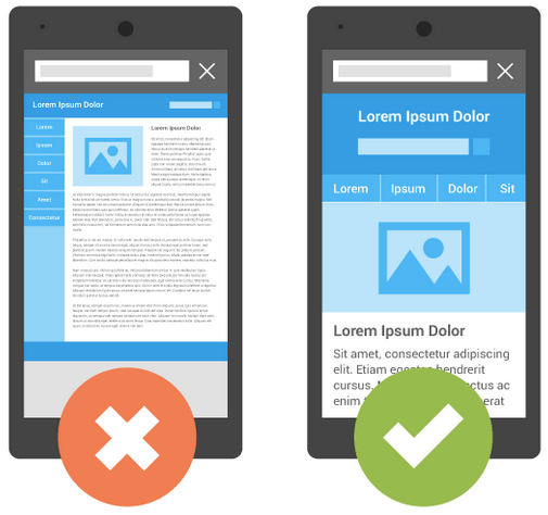
Today, almost all consumers use their smartphones for a lot of things. These devices have been packed with a lot of computing power that the future may well be fully mobile. You need to ensure that your website can keep up with the needs of your target audience by implementing a responsive design that will present your content in the best light.
Here are three factors that mobile-friendly websites have:
- Efficiency Your website must make your customers’ lives a bit easier. User experience is a critical factor that has a significant effect on your ranking. In your domain, whether they’re accessing it through a PC or mobile device, people should be able to find the information they need or do the action they want without difficulty.
- Convenience Because of the limited screen real estate, your website will be getting; it’s essential that you identify which sections are crucial and should be viewed immediately by your customers once they click on your link in the SERPs. Determine the actions that most users do on mobile and support those tasks to help them accomplish their objectives in the most straightforward way possible.
- Responsiveness Your website must have a responsive web design or RWD, which involves having a layout that adapts to the screen size of the device that your customer is using. You will still use the same URL and code for the page; only the display varies depending on whether the user is opening your site from a computer, mobile phone, or tablet. The primary advantage of RWD is that you just need to operate one version of your website instead of maintaining two separate links such as www.sitesample.com and m.sitesample.com.