5 Best Web Design Practices For Improving Usability
-

Aaron Gray
- Blogs
-

 June 06 , 2023
 -
 13 min read
Before anything, I’d like you to ask yourself the following question:
“What would life be like without the internet?”
It may be a good or bad thing, depending on your answer. This piece of modern convenience has, in every sense of the word, brought people from almost every corner of the world closer. Imagine the information you need or the person you have to talk to in just a few clicks or taps. It wouldn’t be surprising if you thought life without it would be unimaginable.
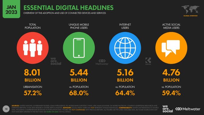
The spike in dependence on the internet is unprecedented for a technology that just turned 40 last month. Internet World Stats estimates that there are around 5.4 billion Internet users worldwide as of 2021 – two for every three people. To put that into perspective, that number was only over 3.4 billion in 2016, which at the time comprised less than half of the world’s population.

These figures should be persuasive enough for businesses to make their online presence prim and proper. Slow loading times, widget errors, accessibility issues – any of these glitches in a website is a good way to miss out on significant revenue.
“Big deal,” you might argue. “My target audience is only people from [insert city or state here].” But that’s missing one key aspect: Word spreads like wildfire on the internet. Years of reputation-building can be undone in a matter of days. Suddenly, every person in the locality has heard or seen the problems with the website and is reluctant to do business with whoever owns it.
The world won’t be dropping the internet anytime soon, hence the need to ensure a website’s usability. Fortunately, this is what we’ll be discussing in this post.
Designing Around Human Nature
The web design usability principles explained in this post hinges around a single tenet: Usability is designing around human nature. Our brains are hardwired to prefer easy ways of doing things. As former Swiss banker David McQuillen puts it: “[Usability] recognises that humans are lazy.”
His words, not mine.
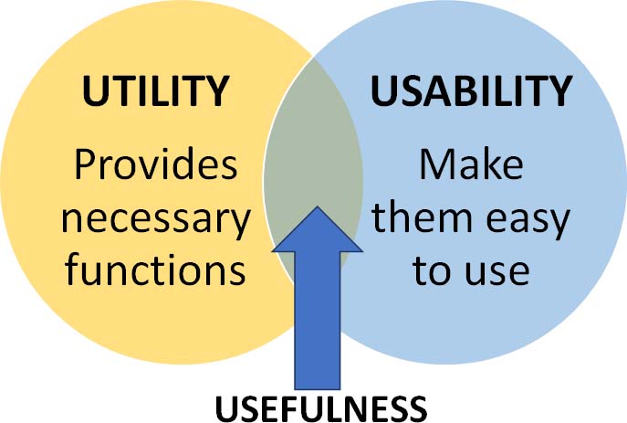
Whether or not you agree with him, usability forms half of the formula for a useful product—a website, in this case. According to the Nielsen Norman Group, an authority in user experience (UX), usefulness is the sum of usability and utility.
Nielsen Norman also stresses that usability is critical in keeping potential and existing customers from leaving. It’s hard to blame them for doing so if the landing page doesn’t provide the details they’re looking for, let alone check out their carts. And as discussed in a previous blog post, cart abandonment is serious business.
Achieving usability in web design requires five key components. While experts have different interpretations, I prefer the Interaction Design Foundation’s explanation, where the components boil down to five E’s, namely:

Usability in web design isn’t a one-off task, either. Industry experts often advise redesigning a website every two to three years to keep up with the unceasing march of technology. As such, expect usability to be on the agenda that frequently.
Best Practices For Improving Usability
If we’re to discuss every recommended practice in improving the usability of a website, this blog post will have words for days. While longer posts are good for SEO, you may prefer to cut to the chase. Therefore, here are the practices that I believe site owners should consider more.
- Before anything, test the old design
Designing a new product requires a prototype, websites being no exception. In this case, no other kind of prototype comes close to one that already exists.
Nielsen Norman explains that the current website is the best prototype for any redesign because it already implements most of the features the owner deems necessary. It doesn’t imply that the website executes these features flawlessly, but it beats starting from scratch. It also gives owners a clear idea about the features that visitors love and those that need improvement.
One common approach to this practice involves conducting a competitive usability study. Apart from your old design as a prototype, it won’t hurt to take notes from competitor site designs to determine the features they’ve heavily invested in. The study usually lasts one to two days and requires two to four competitor sites.
Anything over two days and more than four competitors can get too overwhelming and costly. Below are some guide questions for shortlisting the best possible competitors for comparison.
- Does the site contain the same content and work the same way as yours?
- Does the site offer an excellent user experience?
- Does the site have features that make it stand out in the industry?
- Is the site owner your most formidable competitor in the market?
- Do consumers tend to compare your site to that of the competitor?
Experts advise against implementing every possible change on the website in one go, as it can overwhelm visitors. People tend to resist change during the first few stages of the redesigned website’s lifespan. That being the case, exceptions to the rule exist, such as if your website is an underdog in the competition.
- Keep the new consistent with the old
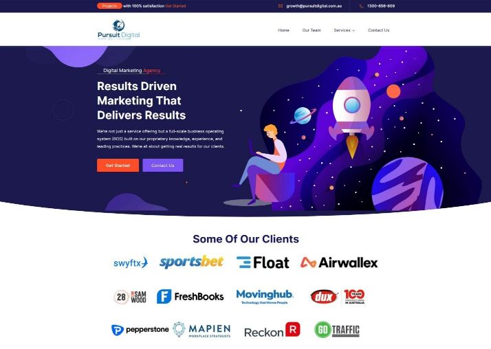
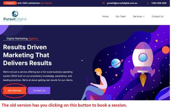
Take a look at the images below. The first is Pursuit Digital’s old home page, as captured by the Wayback Machine in October 2022.
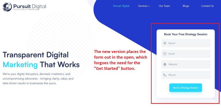
Next is the current home page, which we began using around this year.
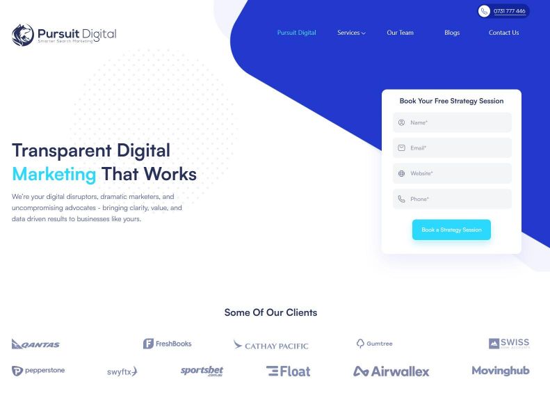
Naturally, you’ll notice plenty of changes right off the bat, such as the form for people interested in a free strategy session. But for the most part, navigation remains as straightforward as before. The navigation menu on the top of the new one still has the same options as the old one, and our client portfolio is still there for all to see.
An asset that doesn’t require a once-over should stay the same when creating a new design. After all, why fix something that isn’t broken? Why drop it when it still serves its purpose effectively?
Consistency is a must in web design for two reasons. First, if assets from the old stay unchanged in the new, visitors won’t have to relearn how to use them. This is important for businesses that maintain separate websites for different products or services. It’s easy for people to mistake a site with a different colour scheme from its parent site for another company.
Second, because people bring their experiences with them, consistency ensures those experiences will still be applicable. This, in turn, mitigates confusion, too often a source of negative emotions like frustration. Making them spend more time trying to make an asset work when they could be doing more important things isn’t an ideal way to keep them on the site.
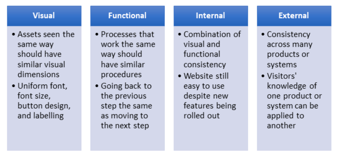
Achieving consistency requires meeting the conditions for its four types.
Prioritising consistency won’t always result in many changes, but as I’ve elaborated earlier, it doesn’t mean it’s bad. The important thing is that you changed something because there was something wrong with the previous design. Otherwise, it pays to be consistent moving forward.
- Design with users with disabilities in mind
A report by the World Health Organization estimates that 15% of people worldwide suffer from one form of disability, with 2% to 4% being severe cases. While far from being the majority, it still translates to over a billion people needing a helping hand.
Whether or not your business caters to such, you can never go wrong with bearing accessibility in mind when it comes to your web design. By including elements that greatly help users with disabilities, you create a website that’s usable for everyone. In fact, the World Wide Web Consortium’s (W3C) Web Accessibility Initiative states that there’s plenty of overlap in this regard, as shown below.
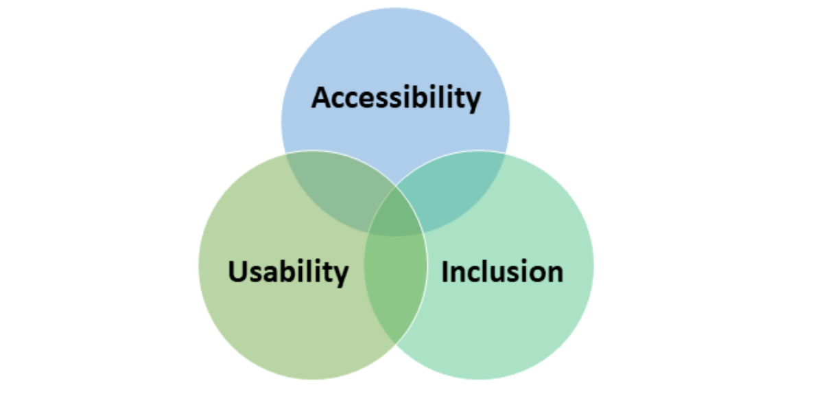
According to the W3C, accessibility “addresses discriminatory aspects related to equivalent user experience for people with disabilities.” An accessible web design treats users equally, regardless of race, sex, education, religion, or – more importantly – limitations. Features designed to assist people with disabilities can also be beneficial in some situations for non-disabled individuals.
Accessibility is so crucial in web design that the W3C deemed it prudent to introduce a set of guidelines in 1999 called the Web Content Accessibility Guidelines (WCAG). WCAG 2.1 has been the standard since 2018, though WCAG 2.2 is expected to be finalised this April.
We won’t go too in-depth in discussing these guidelines (they warrant their separate blog post). In the meantime, the critical thing to know about them is that they’re divided into four primary aspects, which industry professionals refer to as POUR.
- Perceivable – Content and assets must be perceived by all of the human senses.
- Operable – Interface must not require a process that’s impossible for a user to do.
- Understandable – Operating the interface must be within human comprehension.
- Robust – Content must be interpretable by various assistive technologies.
Unfortunately, many designers and developers tend to focus too much on the technical aspects of web design. As this post can’t stress enough, human interaction is required to achieve usability in web design. One sure-fire way is to involve people with disabilities from design to evaluation.
- Design for mobile
This practice should come as a no-brainer for any web designer. Mobile device usage has been on the rise since the introduction of the first-generation iPhone, and there have been no signs of that trend slowing down. Recent statistics show that there’s now as many unique mobile users as internet users globally. That isn’t including the number of mobile devices each user owns.
But okay, you’re probably tired of hearing an industry justify a trend using impressive numbers. Even then, I still highly recommend designing for mobile users for one apparent reason.
You can’t bring a PC everywhere.
Need directions to the nearest restaurant or gas station? Looking for the best eats and shops close by? Must know something to win an argument with a friend or stranger? It would be impractical, if not downright silly, to set up your desktop computer on the spot every time you need to do all these things. Mobile devices let you do just that and more with a few taps.
This level of convenience has caused disruptions in multiple sectors, web design included. With the wind blowing in favour of mobile devices, many designers and developers have advocated for a “mobile-first design.” This design philosophy stresses planning web designs with mobile devices and users in mind before non-mobile device users.
In doing so, you’ve come up with the features that’ll make up the heart of your web design’s UX, making planning for designs for other devices much more manageable. As the screen gets larger from mobile, you can start adding more functions to enhance the UX for non-mobile users.

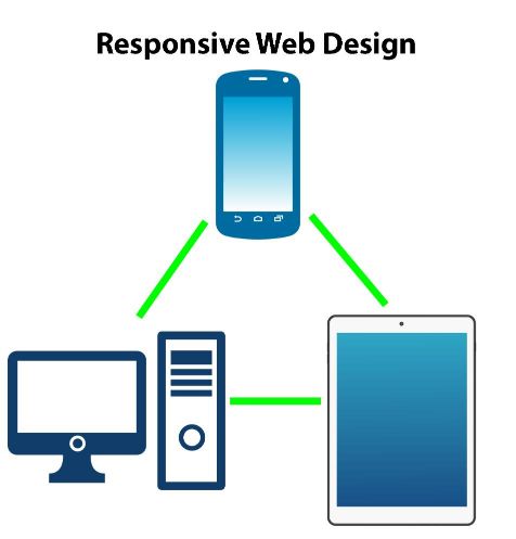
Note that mobile-first design shouldn’t be confused with responsive web design. While mobile-first design is always responsive, not all responsive designs prioritise mobile devices. Moreover, the former entails creating lean content and reducing visual clutter, whereas the latter adjusts content to the user’s device screen regardless of how much content there is.
In promoting usability for mobile, it pays to understand how people hold their mobile devices, especially smartphones. One analysis shows that people hold their phones in six different ways depending on the device model and context. They usually don’t track how they hold their phone, meaning such patterns can change frequently.
It’s also a good idea to learn how the human thumb works, as most smartphone users use them to scroll or tap buttons. No matter what thumb-sweep charts suggest, the thumb moves more freely than you think. Position the most crucial assets within the thumb’s reach to maximize usability.
- Avoid information overload
As if being called lazy isn’t bad enough, there was a time it was believed that a human’s attention span was shorter than a goldfish’s – eight seconds versus nine. Fortunately, science has debunked it since, arguing that a short attention span doesn’t mean an inability to hold attention. Otherwise, people wouldn’t be binging on Netflix and hours-long live streams.
That doesn’t imply that people will be interested in a page with too much content. One look at the example below feels like your eyes and mind are overwhelmed.

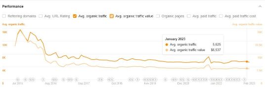
Blinding graphics aside, the example also suffers from points of attention spread all over the place. There’s so much to see here that it isn’t surprising if visitors have no idea where to go. Leave them confused long enough, and they’ll bounce. Just in case, I ran this site on Ahrefs and found that its organic traffic used to be higher.
I’m not insinuating that the design’s mainly responsible for the drop in organic traffic. But I have just two words for it: Hick’s Law.
First conceived in the early 1950s by William Edmund Hick and Ray Hyman, Hick’s Law (also called the Hick-Hyman Law) asserts that the time needed for a person to decide is directly proportional to the number of options presented to them. In other words, the more options they must choose from, the more time they need.
Hick’s Law is everywhere, from ordering from an expansive menu to pondering the correct answer to a multiple-choice question. It’s most prevalent in web design, mainly in the home page’s design.
Let’s return to Pursuit Digital’s home page. Notice how the new version has the booking form out in the open. It may have only saved a user a few minutes, but it saved time nonetheless.
Unless you get down into the weeds, Hick’s Law isn’t that too complicated. LawsOfUX.com, an online version of the eponymous book by award-winning designer Jon Yablonski, summarises it in five key takeaways.
- Show fewer choices to increase response time.
- Break up complicated tasks into individual steps.
- Highlight recommendations instead of the whole catalogue.
- Harness progressive onboarding to minimise cognitive load.
- Avoid simplifying so much that it becomes more complicated.
However, unlike designing for accessibility, Hick’s Law isn’t applicable in every situation. Any website that offers products that mandate in-depth research or deliberation, like choosing where to have dinner or stay for the night, won’t benefit much from this principle. It only works if a person believes that a particular task doesn’t require too much effort to complete.
If I have to sum up this section, it’s to “keep it simple.”
Final thoughts
A website created by human hands will end up being used by human hands; that much is certain. Coming up with features is only half the winning formula; the design must also ensure it’s basic enough for everyone to use, regardless of their background or situation. Only by taking both into account can a website be genuinely useful.
These web design usability principles are by no means the only ones, but they’re the most vital in my eyes. They’ll influence the decisions and directions throughout the web design process, from the choice of font styles to compatibility with accessibility tools. Any compromise you might be forced to make is a small price to pay for success in this competitive market.
Should you need expert help, don’t hesitate to visit us at Pursuit Digital.
Subscribe to Our Blog
Stay up to date with the latest marketing, sales, service tips and news.
