Top Heavy: The First Page Layout Algorithm Update
-

Aaron Gray
-
 April 27 , 2023
 -
 5 min read
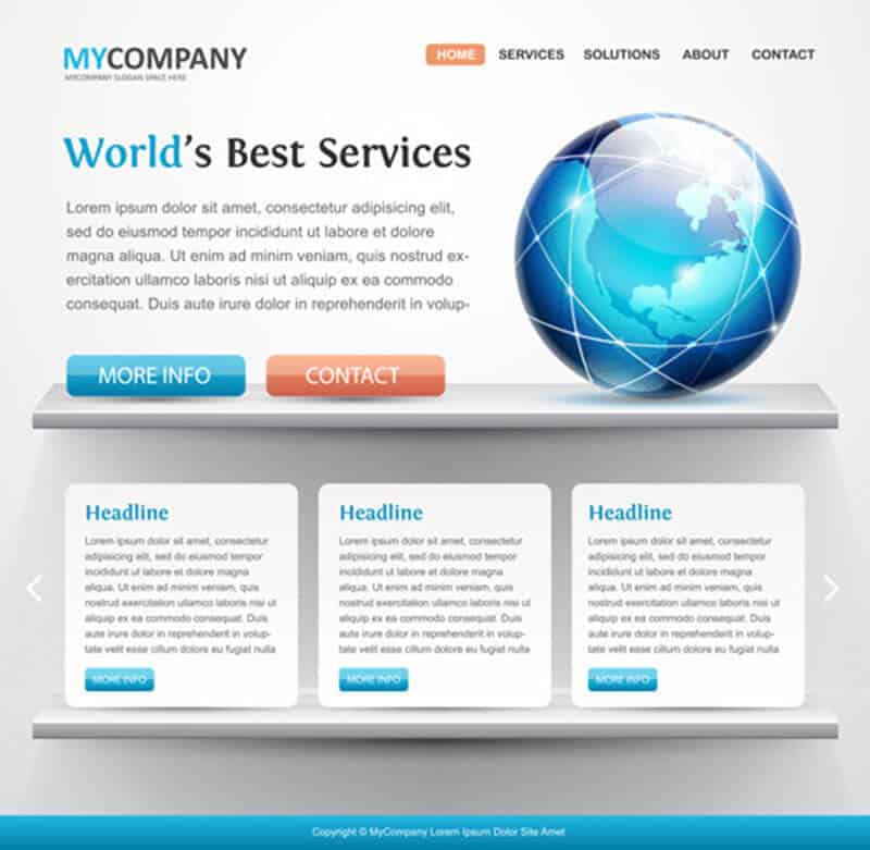
SEOs deemed this update as Top Heavy because the algorithm introduced a penalty for websites that had too many ads “above the fold” or the part of a page that’s immediately visible in a browser window once it loads. The section that users see when they start scrolling down is called “below the fold.”
What’s It For
Before it was rolled out on January 2012, Google guy Matt Cutts announced that they were developing the algorithm update that identifies how much authentic content is above the fold. He also warned websites that had too many distracting or annoying ads, obscuring the information that users want to access, to think about the layout of their pages.
Previously, there were assumptions that the Panda filter was already penalizing ad-heavy pages. However, this separate update implied otherwise. The page layout change stemmed from user complaints about difficulty in reaching actual content from some websites, which led to a frustrating experience. According to Google, sites that don’t have a lot of visible content above the fold or dedicates a substantial portion of its initial screen space to advertisements won’t be ranking high in the SERPs.
The team emphasized that they understand how websites need to place ads above the fold since these perform well and help them monetize their content. They clarified that this update doesn’t affect pages that have a reasonable amount of ads; only those that make it hard for users to access the actual original content. Additionally, pop-ups, pop-unders, and overlay ads aren’t affected by the algorithmic change since it only applies to static ads.
What Were Its Effects
The change reportedly affected less than one percent of searches globally. It means that users will only notice a reordering of results on the SERPs for less than one in 100 searches. Moreover, websites that have been tagged as ad-heavy and fixed the issue immediately had to wait for a few weeks for Google to lift the penalty.
Once site operators have updated their page layout, this particular filter will automatically reflect the changes as bots re-crawl and process your pages to evaluate the modifications. The length depended on factors such as the number of pages on your website and how efficiently the search engine can crawl through your content.
What It Means for You
The concept of optimizing your pages above the fold continues to be a crucial part of SEO today. It is, after all, the first thing that your visitors see, so it makes sense that you have a converting layout. This section of your website can make or break your brand’s first impression to new customers and serve to refresh a returning subscriber’s sense of familiarity with your site.
Here are a few tips to help you optimize your pages above the fold:
- Know the Dimensions – Since consumers nowadays use various gadgets to view pages online, you need to determine your page’s dimensions and how they appear to visitors who are on their computers, tablets, and smartphones. Screen size, resolution, and browser plug-ins are a few significant factors that affect web viewing. You must optimize your website to have a responsive design for mobile users.
- Place Interesting Points Above the Fold – Interesting points are the elements in your page that attract users and entice them to continue reading your content or explore your site further. Create an attention-grabbing title for your blog posts and make sure that it’s clearly visible once visitors click on your link in SERPs. They should also immediately see the first paragraph of the post. Lastly, ensure that the upper portion of your sidebars is noticeable to help them navigate through your website if they want to look at more content.
- Strategically Incorporate CTAs – Call to actions or CTAs are instructions for your site visitors on what they should do now that they’re in your domain. Before, it was believed that these prompts should always be above the fold to gain more conversions. However, it’s not as simple as that. Your CTA placement depends on the type of visitors you have and how well they know your brand.
Here are the two types of visitors and how they affect CTA placement:
- Sure Buyers – Sure buyers are people who either know all about your products and services or are highly interested in what you have to offer. They are the ones who have made up their minds of buying something before they even reached your site. For this type of visitor, you can place your CTA above the fold for their convenience.
- Unsure Buyers – These people require more information to understand how your products and services are beneficial to them. It’s best to put your CTA after your post so you can persuade them to see the advantages of buying your merchandise.


