Responsive web design is pivotal in search engine optimisation. Although it’s not a ranking factor, its implications on user experience (UX) are significant. Statistics show that 88% of users are unlikely to return to a site after having unsatisfactory UX.
Remember, search engines resonate with users’ perceptions. For instance, if your design is dull and monotonous, visitors will likely leave immediately without doing anything substantial. As a result, your site will have a high bounce rate, which may indirectly affect your ranking.
Unfortunately, designing a responsive site visually and structurally eludes many designers and marketers. So, how should you go about it? This article will discuss all the tips you must know as a webmaster.
A brief introduction to SEO

Search engine optimisation (SEO) refers to using organic search results to enhance your website’s visibility. The objective is to have your site rank higher in the search engine results pages (SERPs) and attract more traffic.
The two main types of SEO techniques are on-page and off-page optimisation. What do they entail?
- On-page optimisation focuses on SEO factors occurring within your web pages that are under your control. They include internal linking, content quality, headings, and subheadings.

- Off-page SEO refers to external factors affecting your site’s position on SERPs. Unlike on-page SEO, you can barely control the components in this category because they occur outside your website. Social media marketing, guest posting, and link building are the most common examples.
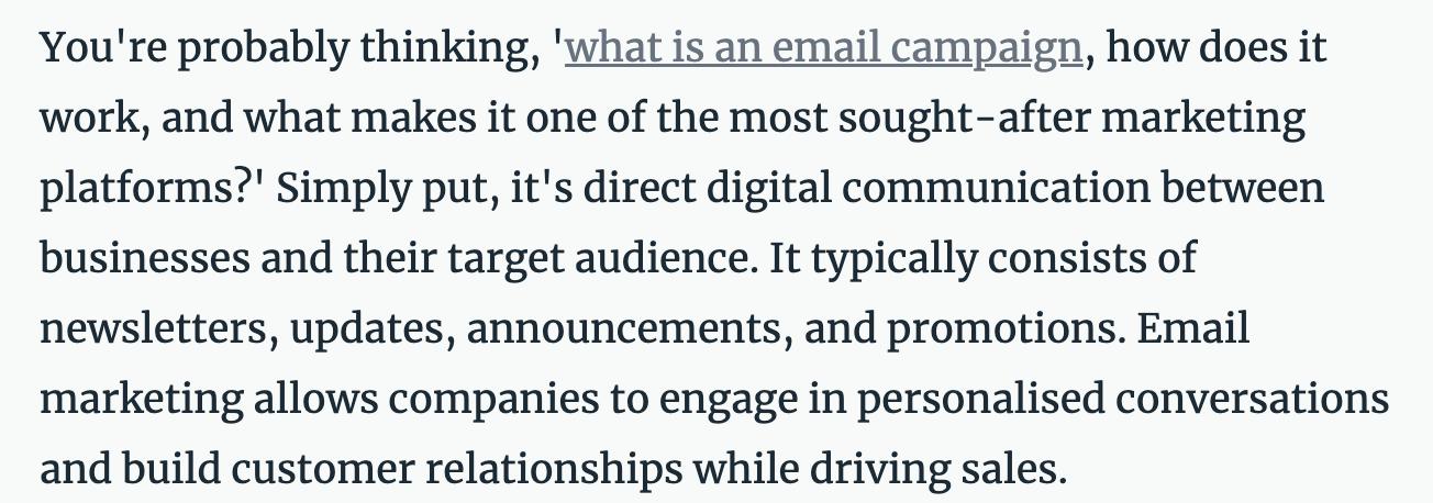
Off-page SEO is important, as it builds your site’s visibility and domain authority. However, its success heavily depends on how you handle your on-page side of things. So, you can see why web design is crucial in everything your business does online.
What Is Web Design?
It involves the creation of a website that reflects a brand’s appearance and information. A good web design must ensure a user-friendly experience. To achieve this, you must balance two crucial web design aspect, aesthetics, and functionality.
A site’s aesthetics entail all visual elements, including;
- Layout: The arrangement of components, such as headers, text, and images on the web page.
- Colour scheme: A combination of colours to create a cohesive feel and look through the site.
- Typography: How you use various text design elements, such as font size and colour.
- Graphics: They include graphical features like images, icons, and texture.
- Visual hierarchy: It refers to using size, colour, and placement to indicate the importance of different elements on the web page.

On the other hand, functional aspects enhance the users’ interaction with your website. Here are some examples:
- Navigation tools, like links and menus, make it easier for visitors to move around the site as they search for the information they need.
- Forms and checkboxes allow visitors to submit information, such as login forms, to the website.
- Buttons and other clickable elements help users download content or purchase products on the site.
- Sliders, animation, hover effects, and other interactive features make the site more dynamic and engaging.
In addition to all these functional features, you’ll need a responsive design for better UX and SEO performance. But what exactly is responsive web design?
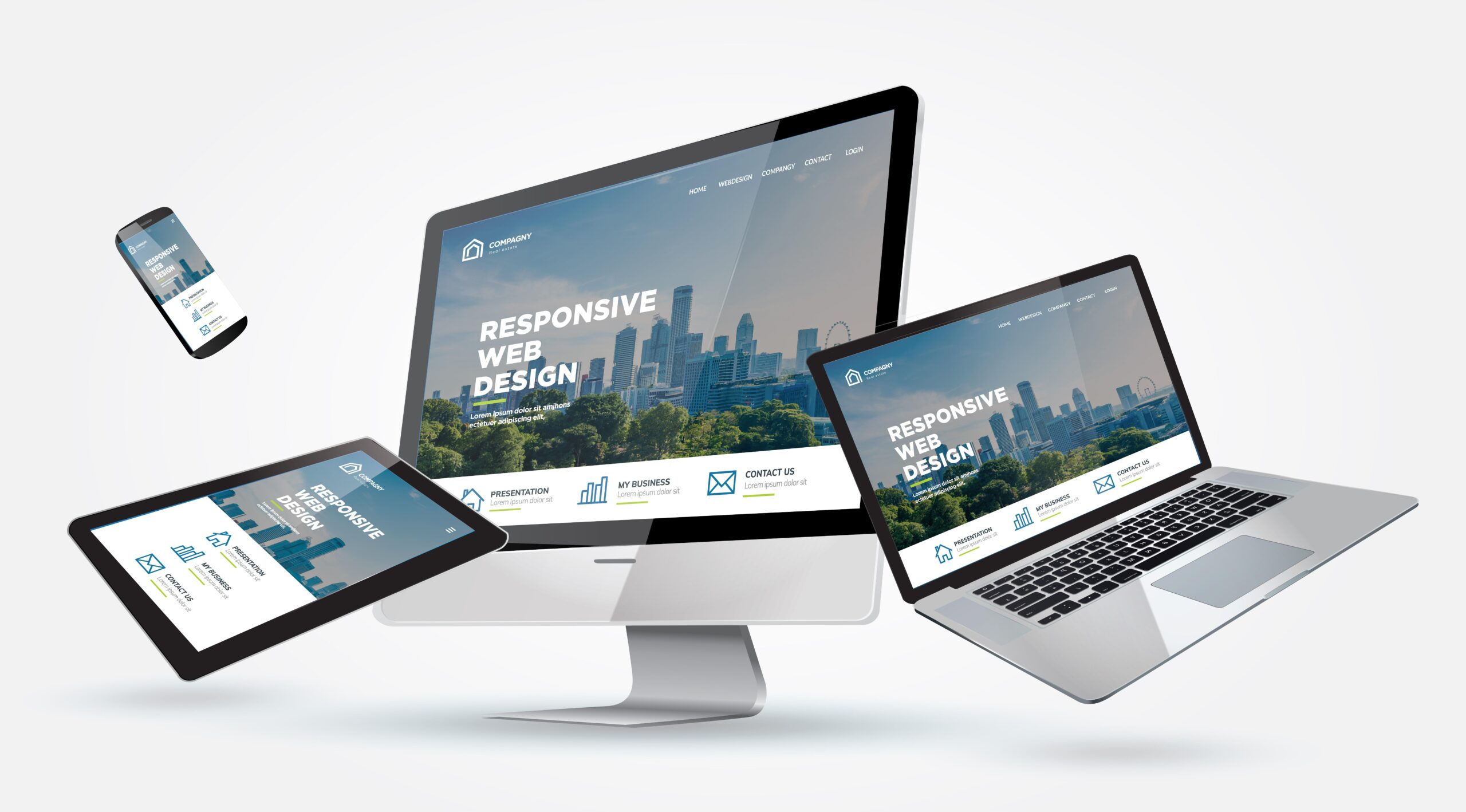
Responsive web design refers to creating sites that respond to the user’s environment and behaviour. For instance, if the browsing device is a smartphone or a personal computer, the site should be able to adapt accordingly. That includes adjusting the screen size, font size, and layout to improve navigation and the responsiveness of various features.
The role of web design in SEO ranking
Good web design can significantly improve your site’s ranking on SERPs. Here’s how:
- Improves user experienceAs mentioned earlier, users’ perceptions influence Google’s ranking system. If users are impressed by your site’s interface, they will likely spend more time consuming your content.When this happens, Google’s algorithm assumes that whatever you’re offering meets the needs of your visitors. As a result, the search engine will recommend your site to other potential consumers. It does this by ranking your web pages higher on relevant search results.
Web design plays a vital role in a site’s user experience. So, investing in proper design techniques will improve the UX, which may ultimately enhance your position in SERPs.
- Impacts technical SEOGoogle always wants to make its users happy by presenting them with relevant content. Besides ‘reading’ the users’ perceptions, Google’s bots or spiders will crawl your site and thoroughly evaluate it.As they crawl each page, they gather information about its structure, content, and links. The crawlers will then determine how to rank the pages in their search engine based on quality and relevance. Google updates its index database to reflect any changes made to the web pages.
Technical SEO is the practice of optimising technical elements to enhance how these crawlers navigate and index your site. Adopting an effective web design plan is the best way to improve this aspect.
Some technical factors include the following;
- Page speed: Faster web pages are often ranked higher on search results. Statistics suggest that the ideal page load time should be within 2 seconds. Anything beyond 3 seconds will significantly increase the bounce rate, which means more users may abandon your site as soon as they visit it.

- Site architecture: It refers to how web pages are hierarchically structured. This architecture is reflected through your internal linking.

Meta tags:
- These tags accurately describe the content of a web page. Search engines and other clients use them to learn more about a page.

- Schema markup: This semantic code helps crawlers better understand your pages’ content. You can refer to it as a structured data vocabulary.
How to Optimise your Web Design for Ranking
Combining your site’s technical and visual aspects can significantly influence how Google ranks you on SERPs. However, balancing the two is where many people fail. So, how should you go about it? Here are some tips for optimising your web design for search engine ranking.
Ensure Mobile Responsiveness
The use of mobile devices to access the internet has consistently increased since 2015. According to a Statista report, mobile web traffic rose from 31% in 2015 to 59% in the third quarter of 2022. It has hovered around 50% for a few years and could surpass the 60% mark in 2023.
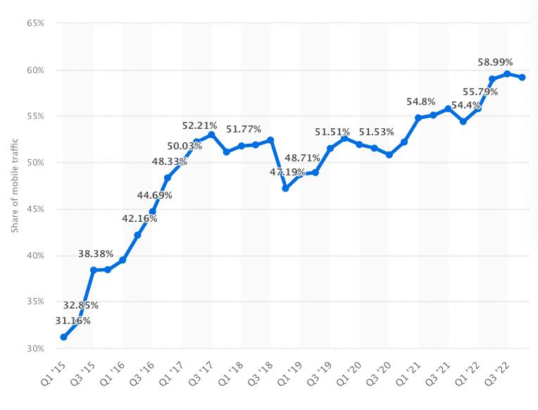
It’s worth noting that desktop web traffic has significantly dropped over the past decade. These statistics show that more people today prefer accessing the internet using their mobile devices rather than desktops.
Given the convenience of portable devices, you can understand this trend. One is likely to walk around with a phone in their pocket and access the internet whenever they want.
Advancement in mobile phone manufacturing has also contributed to this shift. A decent smartphone can do pretty much anything a laptop does except for a few technical aspects.
This change in consumer behaviour has prompted web developers to focus on mobile responsiveness. Since most people will likely use their smartphones to visit your site, it’d be prudent to consider the following web design optimisation tricks:
- Use a mobile responsive layout
The most crucial step is choosing a mobile responsive theme and layout. Whichever template you use should adapt to the mobile devices used by your visitors. The users should enjoy comfortable access to your content, whether using a tablet or a smartphone.
Fortunately, top website builders have covered mobile responsiveness across most of their templates. So, it’s all about selecting a suitable template for your project. But always check their previews to ensure that they fit your design preferences.
What if you’ve already built a non-responsive site? Most themes allow you to switch them seamlessly.
But if you built your site using the older versions, it might not be that straightforward. You can try adding this code to thetag of each page:
It’s not a guaranteed fix, but it should force your pages to readjust to fit the device’s width automatically.

- Make the site as light as possible
The speeds may worsen further when using a mobile device to access the site. You already know this is a crucial ranking factor. So, you may lose out to the competition if your pages are ‘heavy.’
How will you make your website as light as possible to enhance mobile responsiveness? Start by compressing images before you upload them to your site. Use a tool that can resize without losing quality for better results.
Another great trick is to host your videos on a third-party server. For instance, you can upload all your videos on YouTube and then embed them on your pages. That means most of these videos’ virtual ‘weight’ is kept on YouTube rather than your site.
- Simplify navigation
Your site’s navigation system can significantly impact the user experience. Menus and buttons should be easy to use, and you can simplify the process using a sticky navigation bar or hamburger menu.
Reducing the number of menu items can also help streamline the user interface. It can be pretty confusing when the menu has many options. If you must do that, then use clear and concise labels.
You might also want to resize and reposition the buttons. A ‘good’ button can turn into a ‘bad’ button if you don’t optimise these aspects.
Most smartphone owners use their thumbs to navigate web pages. Anything beyond the reach of their thumbs is a total pain. Therefore, it’s wise to have essential buttons at the bottom and secondary items at the top.
You can also consider spacing out your links. Given the screen size of most phones, people can easily click the wrong hyperlinks accidentally when they’re too close to each other.
Optimise Your Content
Content creation is one of the most crucial parts of web design. You may struggle to retain your audience if you don’t have great content. Potential clients will likely abandon your page regardless of the graphics quality and ease of navigation.
So, your second biggest step should be content optimisation. It involves creating top-notch content that aligns with the target audience’s interests. Remember, Google recommends high-quality results to its users, and you can only appear in this bracket when your content is up to par.
Images should be top of the list in your content optimisation project. Compressing images and other media is essential for a site’s load time, but you’ll need more than speed.
As web spiders crawl your site, part of the things they analyse is images. However, they can correctly index them only when they understand what your pictures entail; that’s where alternative texts (alt texts) come in handy.
Consider the example below:

You already understand the image above just by looking at it. But Google crawlers will need something to point them in the right direction, and alt texts do that by providing a relevant description.
So, how can you leverage the power of alt texts to work in favour of your SEO performance? First, accurately describe the images to avoid unnecessary misinterpretation. Google bots use this information in their ranking system. Thus, any ambiguous phrases may reduce your ranking points.
Ensure you use relevant keywords. In the example above, ‘chocolate’ and ‘cookies’ will help Google understand the image’s content and where it falls in SERPs. The flow of these words should also sound natural.
Another thing you’ll notice in the screenshot is that the alt text has eight words. Crawlers may struggle to read long-form phrases. So, anything below 10 words is ideal for effective engagement.
Use SEO-Friendly URLs
The URL structure is another factor that can greatly influence your SEO performance. SEO-friendly URLs can optimise your site for search engines, as they are easy for crawlers and other clients to understand. They also provide valuable context about a particular page’s content.
But how can you create SEO-friendly URLs? Here are some tips:
- Use descriptive words: When creating URLs, use descriptive words that accurately reflect the page's content. This helps both search engines and users understand what the page is about and can improve the page’s visibility in search results.
- Keep URLs short and simple: Shorter URLs are easier to read and remember for users and search engines alike. Avoid using long URLs with multiple parameters or unnecessary characters.
- Use hyphens to separate words: Use hyphens to separate words in your URLs instead of underscores or spaces. This helps search engines read the URL more efficiently and can improve the page’s visibility in search results.
- Avoid complex structures: Avoid using complex URL structures that include multiple subdirectories or parameters. This can make the URL challenging to read and understand and may also be seen as spammy by search engines.
Here’s an example of SEO friendly URL:

Be mindful of JavaScript and Flash
The programming language you use on your site can significantly impact its SEO performance. JavaScript is one of the most popular options in web design, but it can quickly reduce your ranking. The same can be said about Flash, a platform based on the ActionScript programming language.
The benefits of Flash in the web development industry can’t be ignored. However, it has declined significantly in recent years. This drop in usage can be attributed to its need for a Flash Player, security vulnerabilities, and compatibility issues with modern smartphones.
It’s also inefficient, as it uses too much energy and slows down browsers, which can reduce your SEO performance. So, the best advice here is you shouldn’t use Flash excessively on your website.
What about JavaScript? JS is one of the best languages in this industry and is ideal for back-end and front-end web development. But overusing it gives Google crawlers a difficult time, which means that any critical content within these elements may not be visible to search engines.
Although Flash and JS have distinct benefits, you should limit their usage. This way, you can’t miss any SEO opportunities that would improve the search engine rankings for your website.
Conclusion
User experience is key to your SEO success and web development plays a crucial role in it. Some of the best ways of improving your site’s UX is by guaranteeing mobile responsiveness. This includes the use of a mobile-friendly layout and compressing images to make the site as light as possible.
You need to optimise your content as well to make work easier for Google crawlers. Keep in mind that the nature of your pages and content determines how these bots will index your site. So, see to it that the page layout and image alt text complement the rest of your site with regard to relevance and responsive navigation.
And as mentioned earlier, you should be careful with Flash and JavaScript. Of course, the former is no longer popular, but if you must use it, then do so sparingly. On the other hand, JS is the ideal choice for most developers because of its simplicity. However, you shouldn’t use it excessively since that could hurt your SEO performance.
