How to Ensure Your Site Is Optimized for Mobile Search
-

Brian Kiprotich
- Blogs
-

 August 21 , 2023
 -
 9 min read
In an era of rapid technological advancements, digitisation has become an integral part of nearly every industry. As businesses adapt to this digital landscape, one aspect that cannot be overlooked is the importance of mobile devices.
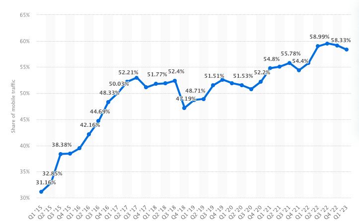
Mobile search accounts for over 58% of web traffic, an increase of about 27% since 2015. With most people relying on their smartphones and tablets for almost everything, optimising your website for mobile has become a crucial element of any successful digital strategy. It directly impacts your website’s visibility, user experience, and ultimately, your business’s online success. So, to match or surpass your competitors today, you must invest in mobile optimisation.
What is mobile optimisation, and why is it important?
Mobile optimisation encompasses any additions or adjustments you introduce to your website to make it accessible on mobile devices. As the name suggests, it’s all about optimising your site or app to meet the needs of mobile users. Some key actions include text and image size adjustment, loading speed optimisation, and improved page navigation.
Most of us have probably come across websites with poor mobile optimisation. Personally, I’ve had difficulties loading some sites’ web content in the past because the developers didn’t consider that some visitors would be using small-screen devices to access their site.
Fortunately, in recent years, web administrators have recognised the importance of mobile compatibility, and they now do their best to ensure their websites can load quickly and effectively on phones and tablets. Otherwise, they’d be missing out on a huge SEO opportunity.
Here are some compelling reasons why mobile optimisation is essential:
- More and more people are using mobile devices as their primary means of accessing the internet. It’s projected that 72.6% of users will access the internet solely via smartphones by 2025.
- Search engines, including Google, prioritise mobile-friendly websites in their search results, giving them higher rankings.
- Mobile optimisation can improve the user experience on your website or app, leading to increased engagement and higher conversion rates.
Given the benefits, it’s clear that mobile optimisation is a must-have in your SEO strategy. Of course, it can be a daunting plan, but always start with the basics and work your way up. Not sure where to begin? Keep reading.
How to optimise your website for mobile devices
Over the years, I’ve seen many websites transition from desktop-focused content to a more diverse plan. You can open virtually any site on both your smartphone and desktop today, which is quite convenient.
However, as a web user and SEO expert, I can tell you that that isn’t enough. Changing the graphics and font sizes to accommodate mobile devices may have been sufficient to give you the upper hand in the past. But today, you need to spice it up to enhance user experience and improve your position on search engine results pages (SERPs).
Consider the following strategies to achieve optimal mobile device optimisation for your website:
- Implement a responsive design. A responsive design ensures that your website adjusts and responds seamlessly to look good on all screen sizes. It adapts the layout of your website depending on the device it’s being viewed on, providing a consistent and more user-friendly experience.
- Enhance load speeds.With mobile users often on the go, they demand fast loading times. If your website takes too long to load, users are more likely to leave your site and check out others. Thus, it’s important to prioritise optimising your website’s load speed for mobile devices.
- Craft mobile-friendly content. Ensure your content is easy to read and navigate on mobile devices. Shorter sentences, easy-to-read fonts, and clear formatting all help.
- Use calls to action (CTAs). Having clear and prominent CTAs can prompt users to take action on your website. Whether it’s to make a purchase, sign up for a newsletter, or contact you for more information, CTAs are crucial in increasing user engagement.
Incorporating these tips into your website design and strategy can help you make significant strides in SEO.
Benefits of mobile optimisation
As I mentioned earlier, many website administrators have recognised the significance of mobile optimisation. It’s an indispensable element of any effective online strategy, and it can benefit businesses in several different ways:
- Improved search engine rankingIf you improve the mobile optimisation of your site, it’s more likely to rank higher in SERPs. Since more people are using mobile devices to view content, Google and other search engines rank content based on the mobile pages instead of the desktop version – a process dubbed mobile-first indexing. Thus, making your website more mobile-friendly means investing in higher visibility and organic traffic.
- Enhanced user experienceMobile optimisation ensures your website is easy to navigate, read, and interact with on mobile devices. This leads to a more enjoyable and efficient user experience, significantly lowering bounce rates and increasing users’ time on your site.
- Increased engagementA mobile-optimised site is more likely to engage users effectively. Whether through easy-to-use navigation menus, mobile-friendly forms, or strategically placed calls to action, these features engage users and motivate them to interact with your site.
- Higher conversion ratesThe primary metric of success for any online business is its conversion rates. You want these numbers to be as high as possible, and I find mobile optimisation to be one of the most effective methods of driving those rates up.
If users find your site easy to navigate and visually appealing on mobile devices, they will likely follow through with the purchase process. They’ll fill out a form or perform another desired action that will take them closer to acquiring your products or services.
How to test your website for mobile optimisation
Ensuring your website’s mobile optimisation is essential to maintaining an effective online presence. There are a few ways you can go about checking your site’s mobile optimisation:

- Google mobile-friendly test: This is a free tool by Google that allows you to check if your website is mobile-friendly. Simply input your website’s URL, and it will generate a report detailing if your site is optimised for mobile. It also highlights any potential issues, giving you a clear idea of what aspects to improve.
- Google Search Console: This is another powerful tool provided by Google. With the mobile usability report in Google Search Console, you can identify any issues affecting your website’s performance on mobile devices.
- WAVE (Web Accessibility Evaluation Tool): WAVE offers a detailed analysis of your website’s accessibility, including its mobile compatibility. It provides insights into potential issues and recommendations on how to address them.
Remember, optimising your website for mobile is an ongoing process. It requires regular testing and adjustment to ensure it remains user-friendly and maintains its ranking in search engine results. With the right tools and a proactive approach, you can successfully optimise your website for mobile compatibility, providing a seamless experience for all your visitors.
Common mistakes to avoid in mobile optimisation
While mobile optimisation is a crucial aspect of modern web design and SEO, I understand how easy it can be to fall into common traps. I’ve worked with many clients who’ve struggled to reap rewards despite investing in mobile optimisation.
Here are some of the things they overlooked and how you can avoid making the same mistakes:
- Lack of responsive designOne of the biggest mistakes you can make in today’s digital world is using a non-responsive design. This usually happens when the content arrangement is the same across all devices, as it may not function correctly on smartphone screens.
To avoid unnecessary frustrations, you must ensure your site automatically adjusts its layout and elements based on the user’s device, no matter the size. This way, you’ll attract and retain more visitors.
- Slow loading speeds

We’ve all been in this situation: you find something interesting on the SERP, but when you click on the link, the web page takes forever to load. When this happens, the next thing you’ll do is go back to the search results page and find a better site that will load in no time.Unfortunately, this is what visitors will do if your website takes several minutes to display content. They’ll get impatient, and you’ll lose potential clients. To be on the safe side, ensure that your page’s load time doesn’t exceed four seconds. With each additional second, your conversion rate drops by about 4.42%. Longer load times also increase the bounce rate, as users won’t be able to complete any task that brought them there in the first place.
For you to get better loading speeds, you’ll need to know the leading causes of this problem. Oversized images top the list, while the rest may include unnecessary JavaScript and a lack of caching.
- Unfriendly mobile contentContent that is hard to read or navigate on a mobile device can frustrate users. This includes content that uses small font sizes, large blocks of text with no breaks, and complex navigation menus.
To optimise your page for mobile compatibility, it’s best to format your content accordingly so mobile users can easily interact with it. Doing so will improve user experience, which is vital to SEO success.
- Unnoticeable or absent calls to actionA call to action is meant to guide users towards desired activities, like purchasing a product or signing up for a newsletter. Some businesses forget to include it, while others do include it but forget to make it visible to visitors. These need to be designed effectively for mobile if you want them to catch attention. They should be easily clickable and stand out on the page without being obtrusive.
- Overlooking mobile SEOMobile SEO is just as important as desktop SEO. Neglecting elements like mobile meta tags, local SEO, or Accelerated Mobile Pages (AMP) can negatively impact your website’s performance on search engines.
Conclusion
Mobile optimisation is essential in any modern SEO strategy. As more people use their smartphones to access the internet, web administrators should ensure that their websites are compatible with these devices. By following the tips provided in this article, you can start your journey towards effective mobile optimisation, expanding your reach to a larger audience of potential customers. Stay ahead of the curve, seize the mobile advantage, and unlock the full potential of your digital presence.
Subscribe to Our Blog
Stay up to date with the latest marketing, sales, service tips and news.
Sign Up
"*" indicates required fields
