As per the latest tally, nearly two billion sites populate the world wide web. Fortunately, only around 17% or 340 million of these sites are active, providing some relief if you're concerned about clutter and competition.
Nonetheless, new websites continue to emerge daily, serving a multitude of business functions, including advertising, boosting web traffic, generating leads, fostering brand awareness, and offering customer service, among others. Amid these time-intensive activities, which include search engine optimisation (SEO), website design often gets relegated to the backseat in some organisations.
Neglecting web design could result in lost revenue opportunities. Your website is essentially a digital embodiment of your company and its ethos. Without it, your audience would barely be aware of your business's existence, especially considering over 60% initiate their purchasing journey with online searches. Worse still is the scenario of owning a poorly designed website that does your business more harm than good. Partnering with a reputable digital agency in Melbourne can help you prevent such outcomes.
But how do you fix this common oversight? How can you increase traffic using different web design techniques? You'll find the answers in this article. Let's start by describing what an attractive web design may look like.
What Makes a Great Website Design
There's no simple answer to such a subjective question, as design preferences vary from person to person. Results from curated web design statistics published by Hubspot will be discussed in different sections of this article - from the most impactful web design elements to the most preferred colours and fonts.
With that aside, here's a research finding that proves digital marketing is challenging: It takes only eight seconds to capture the audience's attention after landing on your website. That's how short it takes for businesses to persuade readers to convert or purchase, so it's best to make the most of your site's visual elements and layout.
Again, there's no one-size-fits-all solution for an ideal web design that boosts traffic, but yours should tick the following boxes:
1. An effective web design for traffic makes a good impression
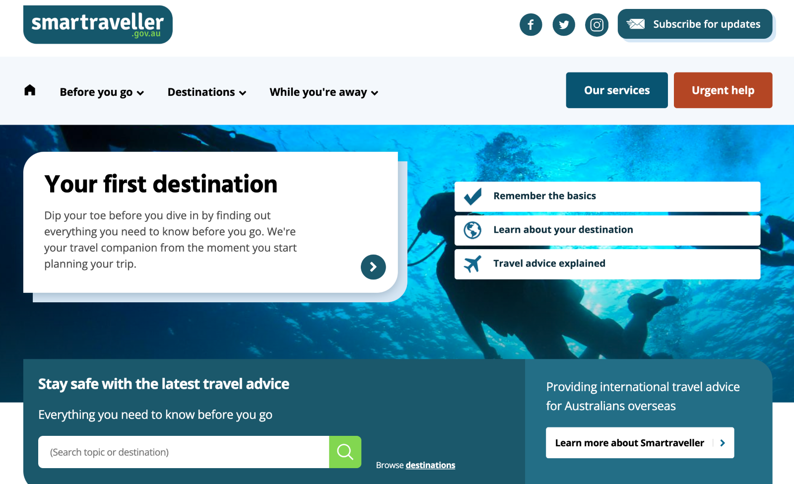
According to recent research, 94% of first impressions are design-related. Survey responders consider the website or application's look and feel before deciding whether to stay engaged or abandon it.
As such, your website's look is the first thing that your audience notices about your company. Visual appeal is a great way to catch readers' attention, making them more receptive to your messages and increasing their chances of understanding your unique value proposition. Your visitors should be welcomed by a clean layout and clear yet compelling messages to convince them to stay on your pages longer.
2. It should aim to enhance user experience
Customers are the lifeblood of any business, and businesses must address their needs to succeed. Firms must reflect this value on their websites, as this channel is often the first point of contact for consumers.

Customers want a seamless, helpful and personalised experience from the get-go. A good website design ensures that visitors can navigate the site easily and find the information they need with relevant content. The site must have a simple yet innovative layout and be optimised for all types of devices. (You'll find out more about readers' site design preferences later).
3. A great website design promotes SEO and visitor engagement
Without practising optimisation tactics, your website will be buried by more popular pages, as search engines won't be able to find and rank it. This is where your SEO tactics come in.
An SEO-friendly web design serves more than aesthetic purposes. It boosts your site's ranking by making your pages machine-readable, responsive and easy to navigate. An attractive website design addresses and fulfils the requirements of human readers and search engine crawlers responsible for arranging the search engine results pages (SERPs). Supported by valuable and engaging content, your site becomes a magnet for users seeking information and help.
Relevant and helpful content is for users, as a logical webpage and site structure are for search engine bots. Both look for hierarchy and the flow of thoughts to understand page content and decide on its relevance and usefulness.
But it doesn't end there.
It's one thing to get found online by readers and another to compel them to spend time on your pages. As you can see below here’s an example of a website where the traffic grew overtime.
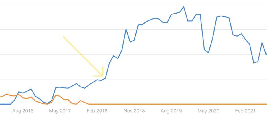
Once readers have clicked through your site, your web design and content should lead to more positive actions like conversions, sharing and linking to your content, comments and others - leading to higher site visits.

But how do web design elements affect site traffic, and how can you use them to your advantage? Let's discuss these further
How to Increase Site Traffic Through Web Design
Web design significantly affects how users perceive your brand and interact with your site. In this case study, a firm had a web design revamp and saw its leads and inquiries rise to 40% and its organic traffic to 99% within 8 months. Similarly, business2community.com reported a 100% increase in traffic and a 42% increase in leads within 6 months following a site makeover.
Using the right website design elements helps businesses hook potential customers and persuade them to learn more about the brand, products and added value. In the cases mentioned, the main drivers identified include adopting a user-centric design, applying SEO strategies, addressing redirects, using natural language, getting better with keyword research and content upgrades.
Below are some design tips for growing your site visitors:
1. Create a responsive web design
Over 4.3 billion mobile internet users worldwide access the Internet regularly, generating around 60% of website traffic. Mobile use has revolutionised the way we buy and altered the purchasing process. Up to 82% of smartphone users consult their phones before making in-store purchases, with 45% reading reviews before purchasing. At least 34% of retail shopping happens online through mobile devices.
Ensuring your website can be viewed across all devices contributes to a positive user experience. True enough, 73.1% of web designers surveyed by GoodFirms believe that a non-responsive design is a primary reason visitors leave a website.
Coined over a decade ago, RWD refers to a web design approach that enables web pages to read well on all screen sizes without sacrificing usability and readability. It's a way to design a website that runs on all devices through these foundational principles:
- Adaptable layouts and grids
- Fluid images
- Strategic use of CSS media queries
- Inclusion of three or more breakpoints
- Prioritising accessibility and simplicity
With the site automatically adapting to the device's image, resolution and scripting capacities, visitors can explore the pages better, increasing engagement, traffic and the likelihood of conversions. Plus, Google ranks sites better when they’re optimised for mobile. Evaluate your site's mobile friendliness by running this tool: https://search.google.com/test/mobile-friendly.

2. Leverage visual design to increase website traffic
Taking a cue from the eight-second rule makes website owners appreciate visual design's importance better. Using site design elements effectively can attract new audiences and promote better experience and engagement, making it vital for website growth.
Humans, by nature, are attracted to eye-catching videos and images. Instead of stuffing your site with too many words, let your pictures do the talking. The design tips below should provide you with some valuable insights:
- Pick great images: High-quality images give the impression of professionalism. These photos can attract visitors and make stellar content even better. Readers likewise prefer seeing original pictures, as much as possible, to know more about your brand's products and services.
- Infographics: This content format can make complex subjects more digestible and easier to understand. As such, 62% of content creators publish infographics bi-weekly, and 55% of marketers use them in social media more than any other visual media, according to Demand Sage. Infographics are also shareable and can earn you backlinks that boost your SEO efforts.
- Videos: The demand for video content is increasing, and 91% of surveyed consumers want more videos from brands, per Wyzowl. As a response, 60% of surveyed companies planned to increase their video marketing budget in 2022, based on data gathered by Statista. The research firm also discovered over 3 billion internet users consume videos at least once every month, and this year's projection will likely peak at 3.5 billion.
- Typography: This term refers to the different text styles, giving them a distinct appearance. Arial, Calibri, Verdana, and Times New Roman are a few of the most popular web fonts. Decreasing or increasing font size or changing their form can create a sense of urgency or draw attention to your key messages. Typography likewise helps create a hierarchy and improve your site's aesthetic structure.
- Pick colours strategically: A 2021 survey done by Top Design Firms asked users about the visual elements they value most on a company website. The report, published by HubSpot, came up with the following results: images (40%), colours (39%), and video (21%). Other essential elements identified were typography, infographics and animation.
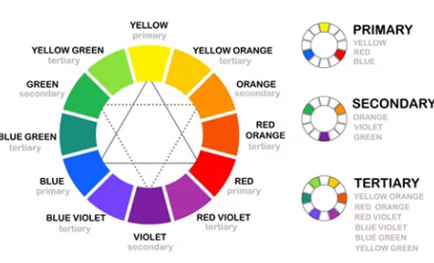
Asked further about colour preferences, here's how participants responded:
- a. Primary colour schemes (26%): either red, blue, yellow or a combination of such hues
- b. Complementary colours (21%): a mix of two colours opposite each other in the colour wheel
- c. Analogous colour schemes (20%): using one primary hue and using two shades directly next to it on the colour wheel
- Know when and where to use white spaces: In spite of the availability and demand for images, videos, and animation that could accompany text content, web designers need to put in white spaces to create a sense of balance and help visitors continue scrolling your pages. White spaces enhance readability by 20% and help direct readers' eyes around the screen, ensuring that the text will be read. These black spaces can make your call-to-action buttons stand out and more compelling. Considering online users' short attention lifespan, it's highly likely that they won't stick around your site if they can't understand your message.
- Craft a simple interface and navigation menu: Up to 65% of the world's population are visual learners, meaning they need to '”see” information to retain it. You don't need to stuff your site with product images and compelling call-to-action phrases to ensure your brand sticks to your customer's minds past the eight-second mark. Besides, 84.6% of web designers believe a crowded web design is a top mistake small businesses make, according to a 2021 GoodFirms research. A user-friendly website can mean different things to different people and varies from business to business. Typically, an effective design is intuitive, fluid and simple. Simplicity should spread to your navigation menu. Your website must enable easy and quick navigation so that visitors can find information easily. They will leave your site and browse your competitor's pages if they don't see what they want, whether it's your company profile, products or services list or contact information. Here's how to do it:
- Organise the headings, menus, tabs and categories according to what your audience searches for
- Place your site's most popular links, including social media buttons, as shortcuts on the footer
- Create landing pages to manage leads and conversions
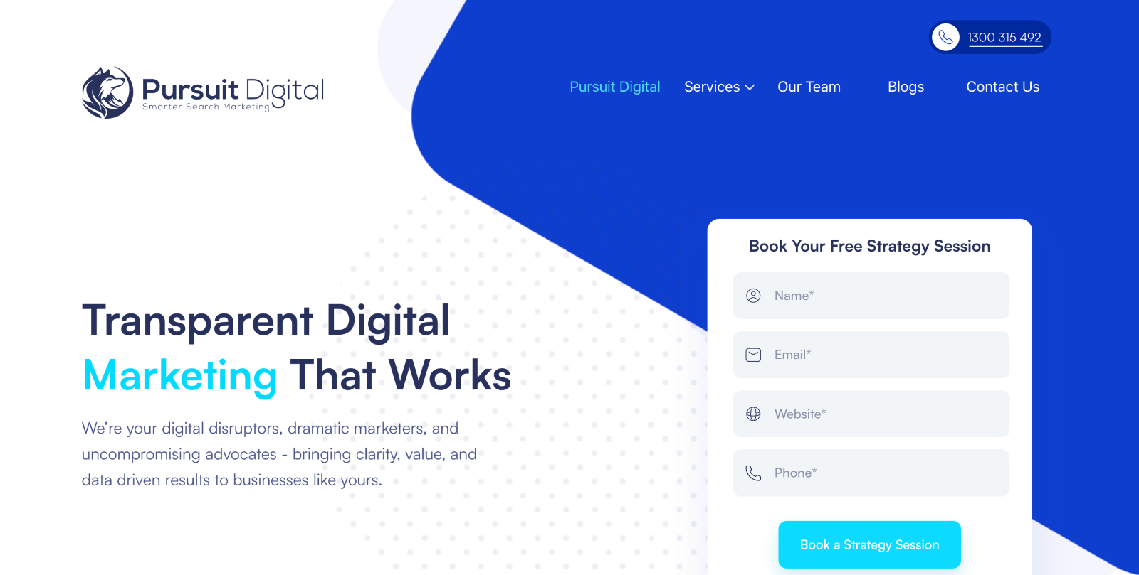
A great visual design ensures content readability by using the right font type and size, placing breaks and white spaces on the right spots, cleverly using colour schemes and knowing the ideal length of each sentence or paragraph.
3. Don't let your design impede fast page loading
Ensure that you don't sacrifice speed to have a fancy-looking website. A quick-loading page is necessary to provide a great customer experience. It's mandatory if you don't want your business website to suffer.
A four-second delay in your page loading time increases the probability of visitors abandoning your site to 90 per cent. About half of your site visitors will likely leave your site if the page they click fails to load in three seconds.
Ensure your site responsiveness by checking the following metrics:
- Largest contentful paint (LCP): measures the loading time after the user clicks on your link. An LCP score of 2.5 and below is good, though striving for a better score should be your goal.
- First input delay (FID): determines the time your visitor interacts with your site to the time your site responds to the said interaction. An FID of 100 milliseconds or faster is good.
- Cumulative layout shift (CLS): is a visual stability metric. The fewer movements and distortions on your page elements, the lower your score - which is what you should strive for.
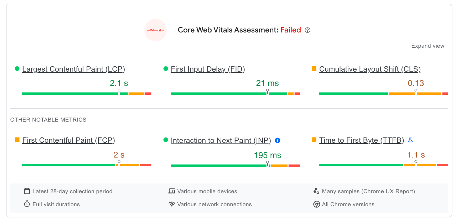
According to Google, users were 24% less likely to leave if a site met specific performance thresholds. Meanwhile, a 0.2 reduction in CLS for Yahoo! Japan paved the way for a 15% rise in page views and a 13% increase in user sessions, alongside a 1.72% bounce rate reduction.
Another study by 55 and Deloitte in 2019 discovered decreasing mobile load times by just one-tenth (0.1) of a second resulted in major increases in conversion rates, 8.4% in retail and 10.1% in travel sites.
Several strategies can help improve your Core Web Vitals, page loading times and overall site health, including:
- Removing unnecessary third-party scripts and large page elements
- Upgrading to a faster web hosting service
- Using a content delivery network
- Adding new user interface elements
- Compressing images to reduce their size
- Ensuring an efficient static cache policy
- Making your HTML and CSS codes consistent
Aligning your design skills and knowledge with consumer preferences hooks them and provides an engaging and positive experience overall. But with technical knowledge to boost site loading and efficiency, you'll gain more traffic.
4. Create an SEO-boosting web design
Incorporating SEO techniques in web design is vital in organic search ranking. Placing high on the search engine results page boosts site visibility and traffic. Most buyers start their journey with a search, and if they can't find your site online, all your hard work will amount to nothing.
Using the most searched keywords in your content is only one piece of the puzzle. Lifting your website status requires other SEO techniques, such as:
- Submitting a sitemap and adding a schema to allow search bots to better organise and understand your pages
- Integrating appropriate meta tags to indicate what the page is all about
- Building a great backlink profile to boost trustworthiness, authority and credibility
- Creating high-quality, engaging and relevant content
You can learn more about designing an SEO-friendly website here to start revamping your web structure and layout.
New and returning visitors, dwell time, bounce rates and conversions are some of the most important metrics that help determine how users interact with your site. Well-designed sites will have repeat visitors and an increasing number of new readers, which bodes well for your SEO. Besides a ranking increase, firms can also expect a boost in trustworthiness and better brand perception, which draws in more customers.

5. Integrate social media links
Humans are social beings. That's why social media has attracted over four billion users to date. Besides maintaining websites, companies have social media accounts to boost online brand visibility and effectively promote their businesses.
Social media links can be placed strategically on your pages, whether on the header, footer or every content page. As users are more likely to log into their social media accounts daily, they're more likely to interact with your brand on these channels. According to Hootsuite, 83% of the estimated two billion Instagram users discovered new brands through the platform.
Embedding social media buttons to your website connects these two platforms seamlessly, leading to more potential visitors. Integrate these links into your website design, upload fresh content regularly, and see your visitors grow.

6. Spot issues and measure impact through a web design audit
If your website has remained untouched for three years or more, it's time to give it a major makeover, as a typical website has a lifespan of around 2.5 years. Similarly, any changes in your web design should be measured for effectiveness.
A website audit is recommended for the former, though you can do the latter independently through these steps:
- Know what your audience wants
- Check your visual branding components (logo, tagline, etc.)
- Ensure consistency across all channels
- Analyse your website's look and feel
- Compare your site with the competitors' pages
- Maintain a checklist of issues and fix them
Review your website structure and layout, and check whether you still have the same target audiences and keywords. Identify your main competitors, and study how their website is put together and what makes them popular with the audience. Check how your website fares and determine your strengths and weaknesses. Aim to close the gap between your site's performance and theirs.

Concluding thoughts
In today's fast-paced world filled with online users with shortened attention spans, it's crucial to convey your key messages quickly yet efficiently. An impeccable web design can hook your audience, draw attention to your brand and amplify your message.
Consumers base their first impression of your brand according to how your website looks and feels, while crawlers rank search results based on your site's technical structure. User-centric and machine-friendly approaches provide a solid foundational basis when planning your website design. Ensuring that both clearly understand your pages leads to better search rankings and a positive user experience.
The tips above help you create a more attractive website that drives traffic and encourages a positive first and lasting impression. Over time, it'll be easier for your brand to build awareness and trust, making your readers more inclined to convert and purchase.
